

Maps don't lie, but humans do
- Renata Barros
- Dec 12, 2025
- 6 min read
How science, storytelling, and bias converge every time we draw the world
Spark
It all started with an email from a Spanish fact-checking newsroom. A viral TikTok video had placed two maps side by side, one showing the forest fires that ravaged western Spain in August 2025, the other displaying the country’s mineral deposits. The conclusion was jumping off the screen: the overlap looked so perfect that the fires, viewers claimed, must have been lit in the interest of mining companies eager to clear the land for extracting rare earths. Needless to say, this came as a shock to the team who created the deposits map—part of the EU-funded Geological Service for Europe project—and to me, the project’s communicator. With the story gaining traction on TikTok, the journalist’s question was simple: is this true? The answer was an obvious no to us. But to make it obvious to everyone else, we need to look closer at what symbols on a map actually mean, and what they don’t.
For this, I’ll need your help. Think of a map of Belgium. What do you see? National borders, three regions, the biggest cities, maybe a few rivers? Some might find it easy to picture the road and rail networks, others the topography and land use, and others the ecological zones. A map is a blank canvas, a two-dimensional frame for representing something about a place. What is shown, and how, is strongly influenced by the humans behind it.
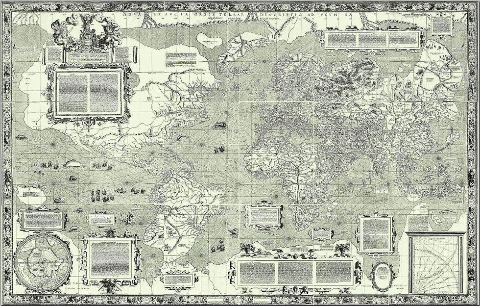
This point might become clearer if you now zoom out of Belgium and think of a world map. Chances are, the image in your mind looks remarkably similar to the one drawn by Gerardus Mercator, the Flemish geographer and cartographer who, in 1569, revolutionized navigation. He was among the first to merge sailors’ practical charts with global geography. The projection he designed remains extraordinarily useful for navigation even today. But like every map, it reflects the worldview of its creator.
Perspectives
Translating a three-dimensional world onto a flat surface inevitably involves approximations and interpretations. The Mercator map, which has endured for centuries as the most familiar image of our planet, still is the work of a 16th-century European at the height of the Age of Navigation. It carries, inevitably, a Eurocentric view of the world. Because the projection preserves angles, it distorts areas, enlarging landmasses farther from the Equator—sometimes by more than ten times their true size. The geopolitical implications are very real: this year, the African Union has officially endorsed a campaign1 to urge governments and international organizations to abandon this map in favor of others that represent Africa’s true scale more accurately.
Having Europe at the center of the world has become such a given that any map showing otherwise feels almost unsettling. That was the case, for example, with a map released earlier in 2025 by the Brazilian government, which inverted the usual north-south orientation and quickly went viral after being featured on the popular Terrible Maps account. It drew over six million views on X alone, and plenty of outrage. Why would the world be upside down? But if a map like this feels strange, perhaps it says less about its accuracy—since having north at the top is no more than a convention—and more about whose point of view we are used to accepting.

If we think of maps as ways to represent our surroundings, from neighborhood to planetary scale, the differences in points of view they reveal become easier to understand. For millennia, people have been sketching rivers, hills, houses, and land plots in an effort to make sense of their place in the world and to share that understanding with others. The Bedolina Map, carved during the late Bronze Age and the Iron Age on a stone slab in the Valcamonica Valley of the Italian Alps, is a remarkable example. That impulse has never left us. But of course, we have come a long way from those early carved representations.


\ The Bedolina Map, carved between 1000–200 BC in the Italian Alps. © Luca Giarelli, CC BY-SA 3.0. \ Scan of the general archaeo-iconographic tracing of the Bedolina Map. © Le Orme dell’Uomo (footsteps of man), CC BY-SA 3.0.
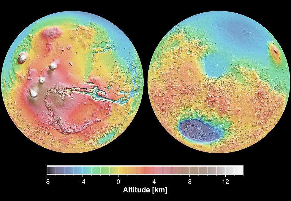
Modern maps are extensively used to translate commercial, touristic, and scientific data into visual stories about the world. Digital technologies have expanded their reach even further, and beyond showing weather or traffic conditions in near real time, they now take on far greater challenges: making climate change visible, highlighting socio-economic inequalities, even visualizing the surface of other planets, revealing patterns we might otherwise miss. One of the most innovative expressions of this evolution is the rise of online map platforms and interactive story maps, first introduced by Esri in 2011, where data, geography, and narrative techniques merge to create immersive forms of scrollytelling that explain complex realities in ways static maps not always can.
Context
From December 13, 2025, the renewed MAP-Mercator museum in Sint-Niklaas2 invites visitors to see maps not only as technical artefacts but as cultural ones that reflect the worldview of their time. As explained by Bram Vannieuwenhuyze, the museum’s Scientific Advisor and Professor of Historical Cartography at the University of Amsterdam, the new museum spans the past and present of cartography, featuring Mercator’s famous 16th-century globes, lesser-known aspects such as the practices of local surveyors, and the many stories hidden in and behind maps.
Among the pieces on display, one that draws the eye is a 1929 map of the former Belgian Congo. The map itself appears purely factual, with neatly drawn provinces, rivers, and towns. But all the information around it reveals another purpose: the slogan “the land of opportunity for young Belgians” at the bottom, portraits of “pioneers” and royal visits framing the sides. A map that seems objective in form is, in fact, part of a narrative of power and propaganda. The practice is far from obsolete, as the naming of gulfs and the drawing of borders remain subjects of heated debate.
A key point is that every map, like any piece of communication, is made for a specific purpose at a specific time. Symbols, colors, and boundaries on a map are deliberate choices based on what the map is meant to show and who it is meant for. Maps are powerful tools for science communication, but they also come with limitations. Some are technical, such as coverage and uncertainty, and some are human, ranging from unconscious bias to deliberate persuasion. None of these should be oversimplified. In a time of fast content, communicating intent and being transparent about the limits of what a map was designed to show has become as essential as the information itself.

Reflection
This brings us back to that viral TikTok video. The overlap between forest fires and mineral deposits looked convincing enough to link them, but maps, like statistics, can suggest patterns where none exist. Correlation is not causation, and visual coincidence is not evidence. The map’s points represent many different commodities, not only rare earths, at various stages of development. Some were already being developed or mined in 2024, which hardly fits the narrative of untouched land burned to ease extraction. It also reflects a familiar scientific limitation: it is a snapshot of the data available at the time. The people behind it added a disclaimer to the original map noting that empty areas didn’t mean an absence of minerals, only an absence of data. The concentration of data points in the area where the fires happened was, in this case, a coverage issue. These details, along with other limitations, were clear to the experts the map was designed for, but got lost in the map’s afterlife on social media. It is, nonetheless, a lasting lesson for anyone using maps as tools for communication. Once a map leaves mapmakers’ hands and enters the wider world, it stops being merely a representation of knowledge and becomes part of the stories people choose to tell.
Author’s notes
The Spanish fact-checking newsroom did an excellent job explaining this case, worth reading if you understand Spanish.3
The MAP-Mercator museum in Sint-Niklaas has undergone extensive refurbishment, and a visit is the perfect plan to rediscover how maps, and the people behind them, shape the way we see the world. I thank Bram Vannieuwenhuyze for his generosity and willingness to share his insights for this article.


Comments